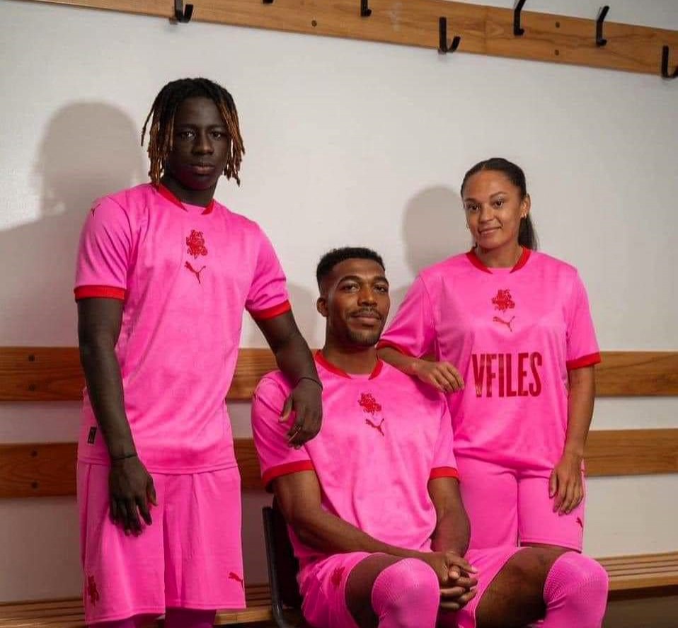
Barnsley FC’s new PINK kit branded ‘truly horrendous’ that looks like something bought from ‘Temu’.
The club has taken a bold approach to its clobber ahead of its League One season opener against Mansfield Town on August 9.
It has released brand new home, away and third shirts for the 2024/25 season.
READ MORE: Sozzled England fan breaks PORCH after coming back from pub following Euro 2024 final defeat
- Advertisement -
The bright pink and red Puma shirt comes with matching shorts and socks and is a slight departure from previous get ups.
Some fans have even compared it to an outfit from the budget shop Temu, known for its bargain buys.
One football fan said: “What the hell is going on at Barnsley FC?
Wow! This is abysmal, truly one of the worst kits of all-time.”
Another said: “Trying to cut down on flood lighting costs maybe?”
- Advertisement -

“Temu kit,” said Daran.
Irene posted: “Very…colourful!”
And Rob said: “It is truly horrendous.”
- Advertisement -
“On Wednesday we wear pink,” joked Lydia.
But a few fans actually liked the colourful kit.
Sam said: “I actually don’t think it’s too bad, it’s plain and a bit boring but not horrific like everyone is making out.”

Adam said: “A festival classic in 10 years.”
The home kit features 21 stars, in reference to the club record unbeaten run in 1934.
The white away kit has a Yorkshire rose on it and the pink third kit features the face of club mascot Toby Tyke.
The kits were created by Reds director Julie Anne Quay, in partnership with Puma.
A club statement said: “The design process involved further conversation with the club historian and feedback from fans, many of whom had a mixed reaction to the viral kit design from season 23/24.
“Barnsley historically is one of the oldest and most iconic clubs in the English Football League. With an FA Cup in the boardroom as well as the winning match ball, the designs this season play on celebrating the wins from the past and using those to inspire the current team to add to the tally.
“The all red home shirt features 21 stars on the chest – a nod to each unbeaten game registered during our club record 21-game run in 1934 – a challenge to break in the upcoming 24/25 season.
“The modified stars are a design continuation of last season’s shirt and build on the global recognition of the Barnsley Football Club brand.
“The away shirt references the Yorkshire rose – printed large on the chest and body – and symbolises beauty, grace and passion. A nod to an earlier Club crest, Barnsley is proudly Yorkshire born and bred.
“In the continued spirit of honouring the past while forging a new path for the future, special attention was given to Toby Tyke, the club’s beloved mascot. As part of this exciting collaboration, an updated badge and bright pink colour scheme were introduced for the third kit, which also features Toby’s face subtly integrated into the front panel and back of neck. Toby himself made a trip to New York City this week to star in the media campaign for the 24/25 season.”
The men’s and children’s kits will retail without any advertisements on the front of the shirt but women’s shirts will feature the VFILES logo – Quay’s company.
The home kit will be in store from July 24 with the others to follow in August – but larger men’s sizes and women’s fit shirts will be later.


